Bar chart:
It is a visual representation of data using a rectangular bar where the height of each bar shows the corresponding value of what is being measured in the chart.
Strategy to write the line chart:
- Understand the chart’s title, units of measurement, given time frames, and additional information in the chart.
- Now read the description carefully by matching it with the abovementioned elements in point 1.
- Highlight the keywords, periods, and measurement units and rephrase them using synonyms and changing structures. In detail, we will look at the sample answer for the bar chart in the last section of this article.
- The general structure of your task includes an Introduction, Overview, Body Paragraph 1, and Body Paragraph 2, Body Paragraph 3 (optional). As IELTS does not have stringent rules on the number of paragraphs and their structure, you can adjust it according to your needs. However, it is essential to plan your essay before writing paragraph-by-paragraph, including the highest, lowest, or most common values you will highlight in the overview and the type of comparisons and numbers to be included in the body paragraphs.
- To write a high-band scoring introduction and overview on any chart, refer to writing Task 1.
- Another pro tip is to use specific vocabulary to specify the numeric values/percentages and categories to be compared or the trends, comparisons, and connecting words for the overview and body paragraphs.
Vocabulary specific to a bar chart:
- Describing trends:
- Increase: rise, climb, grow, surge, escalate, soar
- Decrease: fall, decline, drop, decrease, reduced
- Stability: remain steady, stabilize, remain constant
- Fluctuation: fluctuate, vary
- Describing Changes in Amount or Degree
- Small Changes: slight, marginal, minimal, modest
- Large Changes: significant, substantial, considerable, dramatic, sharp, steep
- Moderate Changes: moderate, noticeable, average
- Time References
- Points in Time: in (year), by (year), from (year) to (year), between (year) and (year) Best synonyms to use in the Introduction
- Duration: over the period, during the period, throughout the time frame, during the span of
- Comparisons
- Equality: equal, the same as, identical to
- Similarity: similar to, comparable to, almost the same, similarly, likewise
- Difference: different from, dissimilar to, contrasting with, unlike, in contrast to, on the other hand
- Superiority: higher than, greater than, exceed, surpass
- Inferiority: lower than, less than, fall short of, not as much as
- Describing Specific Values
- High Points: peak, highest point, top, maximum
- Low Points: trough, lowest point, bottom, minimum
- Middle Range: median, average, mid-point, most common value
- Linking phrases:
- “Additionally, the chart reveals that…”
- “Moreover, it can be observed that…”
- “Furthermore, the data indicates…”
- “Also, noteworthy fact is that…”
- “In addition, the chart illustrates…”
- “It is also evident that…”
- “Notably, the chart shows…”
- “Firstly, look at the…”
Examples of phrases that can be used in the line chart:
- Contrasting Information
- “However, the opposite trend can be seen in…”
- “On the other hand, the data for… shows…”
- “In contrast to…, the figures for… are…”
- “Conversely, the percentage of… decreases…”
- “Unlike…, the data for… indicates…”
- “Whereas…, the figures for… show…”
- “In stark contrast to…, the numbers for… reveal…
- Showing Comparison
- “Similarly, the number of… is…”
- “Likewise, … has a comparable figure.”
- “In the same way, … exhibits a similar trend.”
- “Comparable to…, … shows an increase of…”
- “Just as…, … also…”
- “Much like…, … demonstrates…”
- “In a similar fashion, … shows…”
- Highlighting Trends
- “There is a noticeable upward/downward trend in…”
- “The data indicates a steady increase/decrease in…”
- “An upward/downward trend is evident in…”
- “The figures show a significant rise/drop in…”
- “A clear trend of… can be observed…”
- “Over the period, there is a trend of…”
- “The chart highlights a rising/falling trend in…”
- Highlighting Specific Data Points
- “Specifically, … reached a peak of…”
- “The highest/lowest point is observed in…”
- “A significant figure is seen in…”
- “Notably, … hit a maximum of…”
- “The data shows that… peaked at…”
- “The minimum/maximum value was recorded in…”
- “At its lowest/highest, … was…”
Sample Bar chart:
Consider the example below and implement all the tips that we have discussed
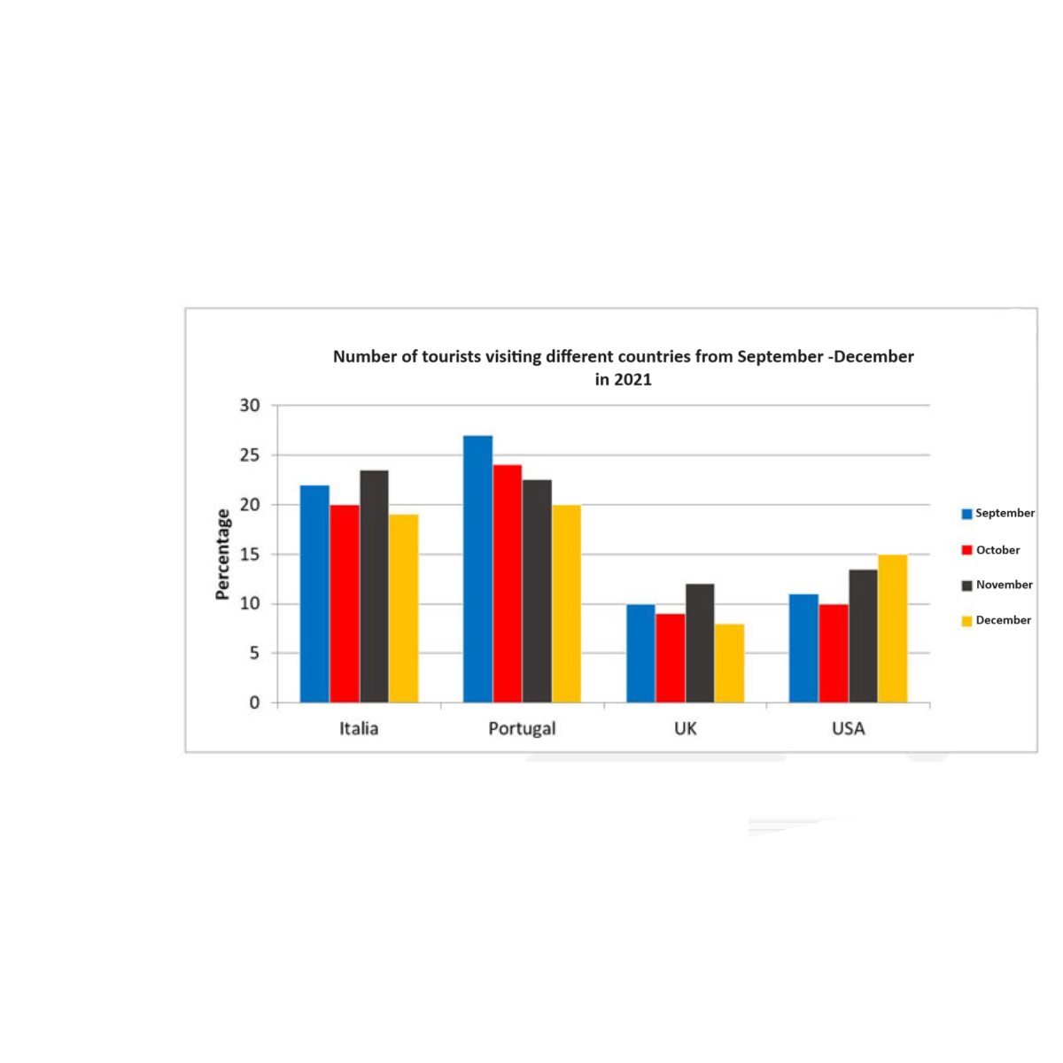
Sample Answer
- For introduction, the keywords are tourists, four countries, from September to October. Using the synonyms and adding extra details to the chart’s description.
The introduction can be written as:
The bar chart illustrates the percentage of travelers visiting four countries—Italy, Portugal, the UK, and the USA – between September and December in 2021.
- Overview – The tip is not to use numbers but to depict the chart’s most eye-catching trends and comparisons. In this case, the most significant difference is the number of tourists in Portugal and the lowest in the UK, a gradual increase of tourists in the USA from September to December.
Now let’s write the overview:
Overall, Portugal experienced the highest percentage of tourists in September and October, while the UK consistently had the lowest rate of tourists throughout the four months. Italy maintained a relatively steady number of tourists, and the USA saw a gradual increase in tourist visits from September to December.
- For body paragraphs, there is no best format or template for writing; choose the best comparisons you can make and mix the general vocabulary with the specific vocabulary to highlight trends of the bar chart.
Let’s write the body paragraphs by comparing the month-to-month visitors in each country.
In Italy, the percentage of visitors remained relatively stable between 18% and 22% over four months, with 21% in September and 18% in December. Portugal experienced its highest visitor percentages in September and October at 27% and 24%, respectively, before a drop to around 20% in November. However, Portugal’s numbers increased slightly to 22% in December.
On the other hand, the UK had the lowest visitor percentages among the four countries, fluctuating between 10% and 13% from September to December, slightly increasing with 13% travelers in October but returning to 10% by December. Conversely, the USA experienced a steady rise in their numbers, growing from 12% in September to 20% by December, showing a clear upward trend over the four months.
Here is the final sample answer:
The bar chart illustrates the percentage of travelers visiting four countries—Italy, Portugal, the UK, and the USA – between September and December in 2021.
Overall, Portugal experienced the highest percentage of tourists in September and October, while the UK consistently had the lowest rate of tourists throughout the four months. Italy maintained a relatively steady number of tourists, and the USA saw a gradual increase in tourist visits from September to December.
In Italy, the percentage of visitors remained relatively stable between 18% and 22% over four months, with 21% in September and 18% in December. Portugal experienced its highest visitor percentages in September and October at 27% and 24%, respectively, before a drop to around 20% in November. However, Portugal’s numbers increased slightly to 22% in December.
On the other hand, the UK had the lowest visitor percentages among the four countries, fluctuating between 10% and 13% from September to December, slightly increasing with 13% travelers in October but returning to 10% by December. Conversely, the USA experienced a steady rise in their numbers, growing from 12% in September to 20% by December, showing a clear upward trend over the four months.