It is a chart that shows the continuous changes over the period with the line; that’s why it is called a line chart.
Strategy to write the line chart:
- Carefully examine the data given and shown in the chart by understanding the chart’s title, units of measurement, given time frames, and legends, which explain additional information about the chart.
- Highlight the keywords in the chart title or given description and look for synonyms and alternate sentence structures to use throughout task 1. For example: “The chart shows the expenditure on consumer goods by countries Canada, France, and the UK.” The keywords are expenditure, consumer goods, Canada, France, and the UK.
| Keyword | Synonym / alternate sentence structure |
| expenditure | Expense, money spent, spending money. |
| Consumer goods | Commodities, consumer products/items |
| Canada, France, and the UK | By the people of Canada, France, and the UK / by Canadians, French people, and Britishers. |
By incorporating some of the above synonyms or alternate sentence structures, the introduction of the graph can be written as:
“The chart illustrates money spent on consumer products by Canadians, French people, and Britishers.”
- Plan your essay before writing paragraph-by-paragraph, including the trends you will highlight in the overview and the comparison and numbers to be included in the body paragraphs.
- Refer to writing Task 1 for a common strategy to understand and write a high-band scoring introduction and overview on any chart.
- Use specific vocabulary to highlight the trends, comparisons, and connecting words for the overview and body paragraphs.
Vocabulary specific to a line chart:
- Describing trends:
- Increase: rise, climb, grow, surge, escalate, soar
- Decrease: fall, decline, drop, decrease, reduced
- Stability: remain steady, stabilize, remain constant
- Fluctuation: fluctuate, vary
- Describing Changes in Amount or Degree
- Small Changes: slight, marginal, minimal, modest
- Large Changes: significant, substantial, considerable, dramatic, sharp, steep
- Moderate Changes: moderate, noticeable, average
- Time References
- Points in Time: in (year), by (year), from (year) to (year), between (year) and (year)
- Duration: over the period, during the period, throughout the time frame, during the span of
- Comparisons
- Equality: equal, the same as, identical to
- Similarity: similar to, comparable to, almost the same, similarly, likewise
- Difference: different from, dissimilar to, contrasting with, unlike, in contrast to, on the other hand
- Superiority: higher than, greater than, exceed, surpass
- Inferiority: lower than, less than, fall short of, not as much as
- Describing Specific Values
- High Points: peak, highest point, top, maximum
- Low Points: trough, lowest point, bottom, minimum
- Middle Range: median, average, mid-point
- Describing Data Categories
- Segments: age groups, genders, sectors, regions, income levels, education levels
- Quantities: percentage, proportion, fraction, number, figure
- Time frames: years, decades, quarters, months
- Linking phrases:
- “Additionally, the chart reveals that…”
- “Moreover, it can be observed that…”
- “Furthermore, the data indicates…”
- “Also, noteworthy fact is that…”
Examples of phrases that can be used in the line chart:
- Contrasting Information
- “However, the opposite trend can be seen in…”
- “On the other hand, the data for… shows…”
- “In contrast to…, the figures for… are…”
- “Conversely, the percentage of… decreases…”
- Showing Comparison
- “Similarly, the number of… is…”
- “Likewise, … has a comparable figure.”
- “In the same way, … exhibits a similar trend.”
- “Comparable to…, … shows an increase of…”
- Highlighting Trends
- “There is a noticeable upward/downward trend in…”
- “The data indicates a steady increase/decrease in…”
- “An upward/downward trend is evident in…”
- “The figures show a significant rise/drop in…”
- Highlighting Specific Data Points
- “Specifically, … reached a peak of…”
- “The highest/lowest point is observed in…”
- “A significant figure is seen in…”
Sample Line chart:
Now, let’s implement everything that we have learned so far in the following example:
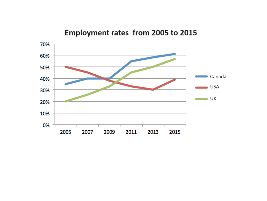
The line graph below shows the employment rates in three countries between 2005 and 2015.
Sample Answer
The line chart illustrates the employment trends amongst Canadians, Americans, and Britishers from 2005 to 2015.

Overall, the number of employed people has increased in Canada and the United Kingdom. Meanwhile, the USA has witnessed a significant decrease in employment rates. Additionally, most employed people were Canadians by 2015.

In 2005, the USA had the highest employment rate with a 50% share, followed by Canada with approximately 35%. Over the years, there was a noticeable decline in the employment rate in the USA, dropping to about 30% by 2013 and finally with a slight increase to 40% in 2015.

Conversely, Canada’s employment rate rose steadily from 40% in 2005 to just over 60% in 2015. The UK experienced the most dramatic increase, starting at 20% in 2005 and reaching around 55% by 2015. The UK’s employment rate remained consistently lower than the other two countries until around 2009. Post-2009, the UK’s rate rose sharply, surpassing the USA in 2010 with 40% workforce and almost matching Canada’s rate by 2015.